Sales Dashboard


Problem
Complex sales environments with advanced data analytics can be extremely useful to make business decisions however more often than not the data becomes overwhelming and it becomes hard to know what is important.
Key Consideration
Clear data visualizations to clearly spot what sales goals are being met and who is falling behind.
Helping users find the signal in the noise.
Giving advanced functionality and analytics without overwhelming the user.
Roles and permissions were a key aspect of the project so that people could see what they needed to without exposing sensitive data.
Background
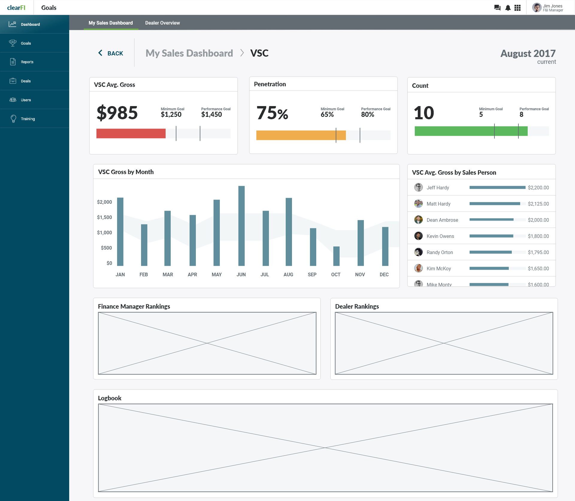
The objective was to create a dashboard for distribution partners to set and track sales goals. The industry had many specific KPIs that needed to be presented so they could keep an eye on the health of their business. Creating data visualizations that met the complex needs of the business was a significant challenge. We landed on some standard charts and also some unique data visualization including a horizontal bar chart that showed the minimum and ideal sales goals for various KPIs.
Users
VP of Sales
Sales Executives
AVP of Sales
Internal Sales teams
My Contributions
Worked with stakeholders to understand the KPIs of the business
Designed high fidelity UX Prototypes
Designed unique data visualizations
Teamed up with development teams to execute design prototypes